13 Inspiring FAQ Page Examples


From ecommerce and SaaS to service businesses, FAQ (frequently asked questions) pages act as a first line of support, helping users navigate common queries, understand complex processes, or troubleshoot minor issues independently. With a wealth of inspiring FAQ examples available, it's easy to see the value of featuring a thoughtfully designed FAQ page on your website.
In this article, we'll share practical examples of FAQ pages we love and discuss their features. We'll also explore best practices that can enable you to craft an intuitive, user-friendly FAQ page of your own to tackle everyday customer questions, reduce support workloads, and elevate your business’ overall user experience.
The 13 best FAQ page examples
Here's a list of inspiring FAQ examples that stand out for their clarity, user-friendliness, and overall effectiveness. Each of these handpicked FAQ pages offers valuable insights and serves as an excellent starting point for creating your own informative and helpful FAQ page.
1. Help Scout
Help Scout is a powerful yet easy-to-use communication platform that facilitates improved customer conversations throughout an organization. Its quick setup process enables companies to create dedicated customer-facing email inboxes, implement effective live chat on websites, and build comprehensive help centers.
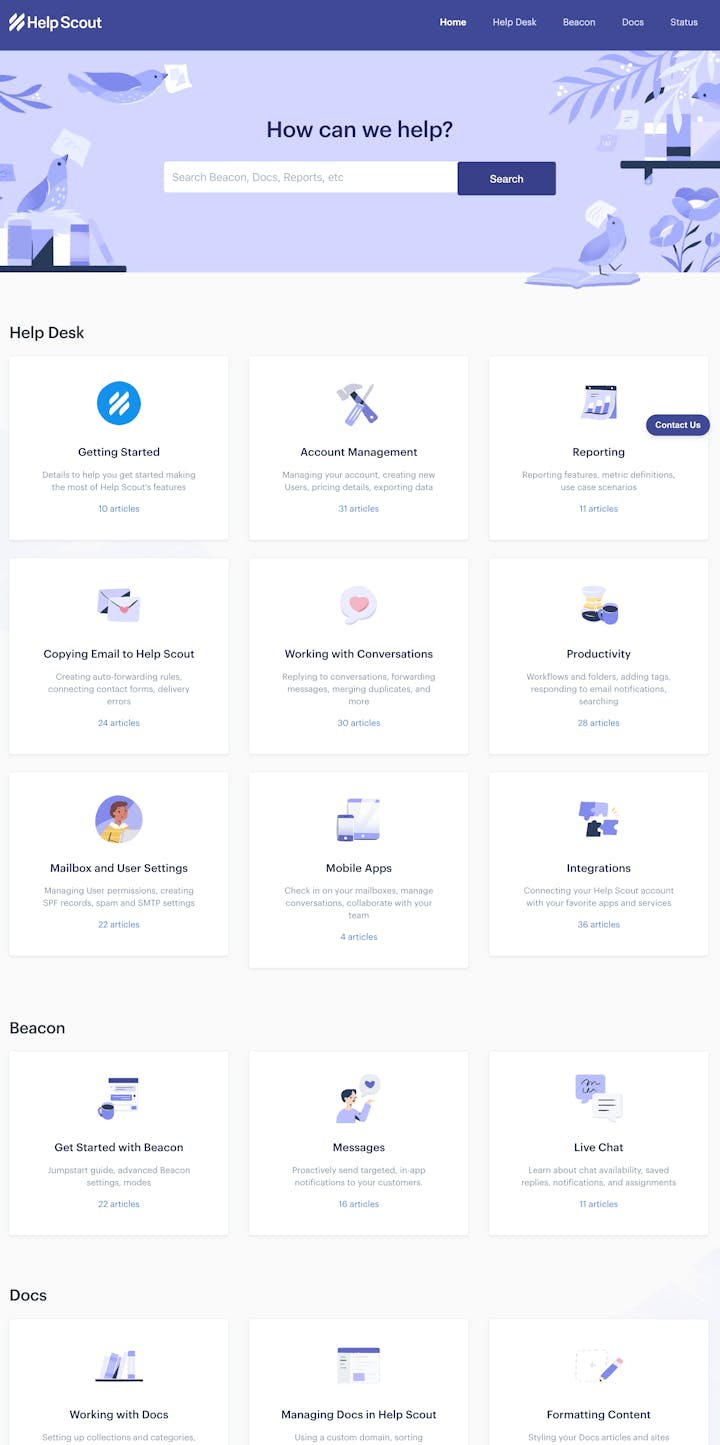
Help Scout's FAQ page stands out for its clarity, its categorization, and the sheer volume of educational information it provides. The layout is clean and intuitive, with every topic neatly organized into relevant sections. Information is not just presented in text — it also uses visual aids for better understanding. The Help Scout page takes a no-frills, straightforward approach to addressing questions, making it an excellent model of simplicity without sacrificing depth of content.
Key features:
Comprehensive categorization: From "Getting Started" to "Managing Docs in Help Scout," material is organized into logical categories, making navigation a breeze.
In-depth articles: Each category includes a series of related articles that deliver in-depth explanations.
Built-in search: The documentation features a search function, enabling users to spot relevant information swiftly.
Mobile-friendly design: The FAQ page works seamlessly across multiple devices, acknowledging the diversity in how users access information.
Easy access: Help Scout’s help center is readily accessible right from the home page, emphasizing the importance placed on immediate, self-serve customer support.
2. Netflix
Netflix is a dominant player in the world of online streaming services, offering a wide variety of TV shows, movies, animation, documentaries, and more on a myriad of internet-connected devices.
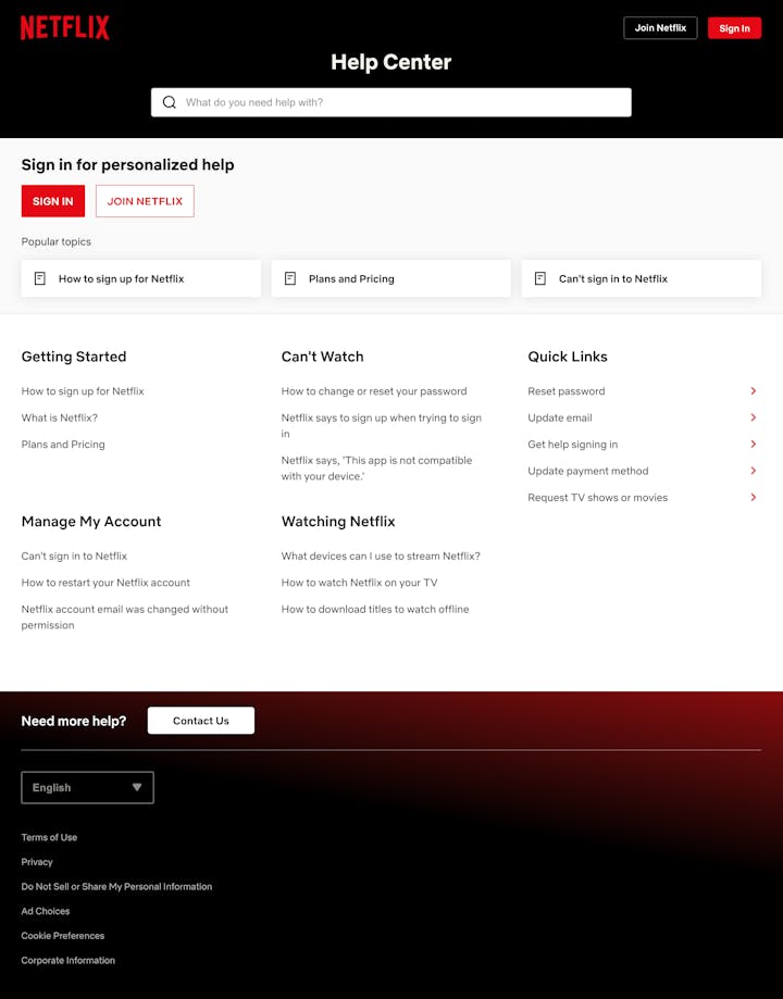
Netflix’s FAQ page, known as their Help Center, is designed to provide immediate customer support. It meets the diverse needs of a global audience by providing comprehensive self-help solutions in a clear, well-organized manner. The Help Center covers everything from basic account management, security, and payment-related queries to technical troubleshooting and content discovery.
Key features:
Broad range of questions: The FAQ page covers an array of issues, making it a comprehensive resource for any Netflix-related queries.
Search functionality: Users can input their questions or related keywords into the provided search bar, fast-tracking their answers.
Categorized sections: Questions are neatly grouped into categories like “Account,” “Billing,” and “Watching Netflix” for intuitive navigation.
Mobile responsiveness: The FAQ page seamlessly adjusts to the user's device, ensuring the continuity of support across platforms.
3. Dropbox
Dropbox is a platform built to reduce work-related stress by facilitating smarter, safer file organization and sharing. It enables users to store their files online, sync them across devices, and share them securely with others.
What sets Dropbox's FAQ page apart is its straightforward setup and the broad variety of inquiries it accommodates. The FAQs are carefully segmented based on different categories, similar to a complete user guide spanning all aspects of Dropbox usage. This FAQ page combines simplicity with depth, providing concise responses to address users' most common questions and a convenient search tool, allowing them to find answers to specific queries quickly.

Key features:
Segmentation: Every FAQ is placed under its relevant section such as "Using Dropbox," "Account," and "Apps and Integrations," easing the user's search.
Integrated search function: Users can directly enter their queries in the search bar to get answers, further enhancing the page's usability.
Step-by-step explanations: Dropbox utilizes sequenced instructions to guide users through various processes, simplifying complex procedures.
Community links: The FAQ page provides links to the Dropbox community, providing an avenue for users to interact and learn from each other's experiences.
Accessible on all platforms: Like many others, Dropbox ensures their FAQ page is easy to navigate on all devices, mobile or desktop.
4. YouTube
YouTube’s video-sharing platform enables users from around the world to upload, share, and view content. Alongside its entertainment value, YouTube has become a crucial marketing, educational, and creative outlet for many individuals and businesses alike.
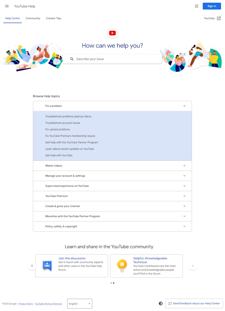
YouTube's FAQ page, also known as the YouTube Help Center, is designed with accessibility in mind. By providing in-depth information on various aspects of the platform, it effectively addresses users' most common questions and concerns. The FAQ page leverages a clean, user-friendly interface, utilizing broad categories, search functionality, and routinely updated articles to deliver relevant and current information.
Key features:
Well-structured categories: Information is arranged into topics such as “Fix a problem,” “Watch videos,” and “Create & grow your channel” to streamline navigation.
Convenient search function: Like many of its counterparts, YouTube's FAQ page is equipped with a search bar for users to find answers directly.
Detailed answers: YouTube provides extensive responses to FAQs, accompanied by how-to articles, tutorials, and video guides.
Multilingual support: The FAQ page is accessible in various languages, reinforcing inclusivity and accessibility.
YouTube Community access: Users can participate in the YouTube Community, enabling discussions surrounding issues or experiences to foster peer-to-peer support.
5. Pinterest
Famed as a haven for inspiration, Pinterest is an online platform enabling users to discover, save, and share ideas via visual imagery.
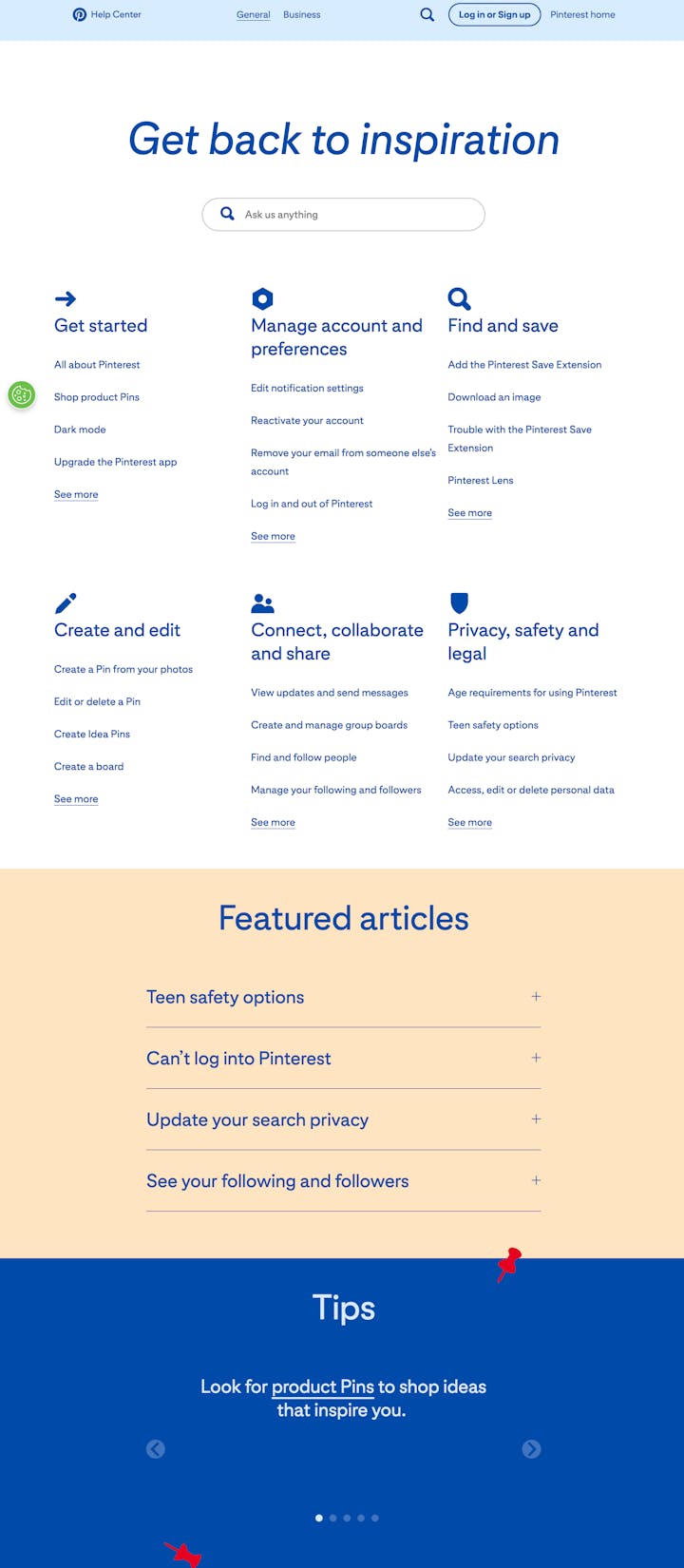
Pinterest's help center offers a comprehensive mix of educational content, feature explanations, and troubleshooting solutions. In keeping with Pinterest's overall design philosophy, the FAQ page holds an intuitive visual layout, with distinct categories for various topics. From user basics and account management information to advice on creating effective pins, the FAQ page feels less like a traditional support page and more like a user guide to an enriching Pinterest experience.
Key features:
Categorized layout: A series of broad categories including “Get started,” “Manage account and preferences,” and “Find and save” eases user navigation.
Feature explorations: For each category, Pinterest provides a variety of articles that delve into individual feature usage.
Targeted search function: A search bar allows users to find swift answers by typing specific queries.
Visible topics: Right off the main page, users can view some frequently sought topics for quick access.
Multi-language support: The Help Center can be translated into more than 30 languages.
6. Etsy
Etsy is a renowned ecommerce platform that enables the buying and selling of unique handmade items, vintage goods, and craft supplies.
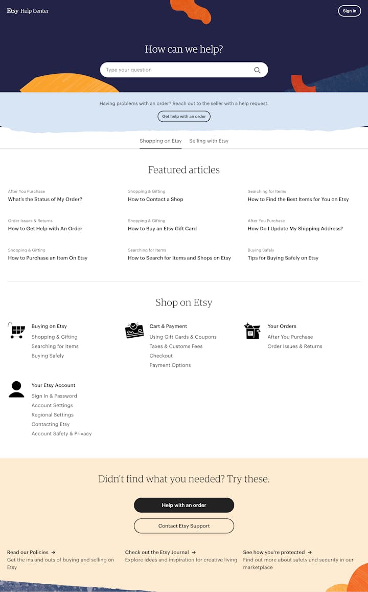
Etsy's FAQ page structure sets it apart by catering separately to shoppers and sellers, ensuring tailored and relevant information for both segments. The dual FAQ page approach allows for clear navigation and efficient access to information, addressing specific needs and concerns. With a categorized layout, an integrated search tool, and extensive resources, Etsy's FAQ page offers a seamless support experience for its users.
Key features:
Segmented pages: Separate sections for shopping and selling cater to different user needs.
Intuitive categories: Each page is organized into relevant topics, such as “Buying on Etsy,” “Cart & Payment,” and “Shop Management.”
Convenient search capability: Users can input search terms or queries into a search bar to find the desired results quickly.
Guides and resources: Etsy offers step-by-step guidance and additional resources to address specific concerns and issues.
Community access: Links to the Etsy community give users an opportunity to share experiences and learn from each other.
7. Shopify
Shopify is an ecommerce solution provider helping businesses of all sizes to set up online stores and sell products. The platform delivers a range of services including payments, marketing, shipping, and customer engagement tools designed to aid sellers in running and growing their businesses.
On the FAQ page, Shopify successfully caters to a diverse array of user questions, from basic queries to more complex, platform-specific issues. The layout is easy to navigate and well-organized into common themes. Shopify ensures their answers are detailed but straightforward, maintaining the balance between comprehensibility and depth of information.

Key features:
Simplified categories: The FAQs are grouped under themes such as “Getting started with Shopify,” “Selling on Shopify,” and “Payments on Shopify” to aid easy navigation.
In-depth answers: Each question is coupled with a comprehensive yet digestible response, keeping users fully informed.
Integrated search feature: Users are able to submit queries in a search bar, improving navigability.
Resource linking: Many responses contain links to additional resources or tutorials, allowing users to delve deeper into particular topics.
Intuitive design: The FAQ page maintains a clean, decluttered look that aligns with the overall aesthetic of the Shopify brand, providing a seamless user experience.
8. Slack
Slack is a digital hub that brings team communication and collaboration into one place, enhancing productivity. Offering services ranging from direct messaging to file sharing and integrated business apps, Slack aims to streamline workflows and eliminate the need for back-and-forth email exchanges.
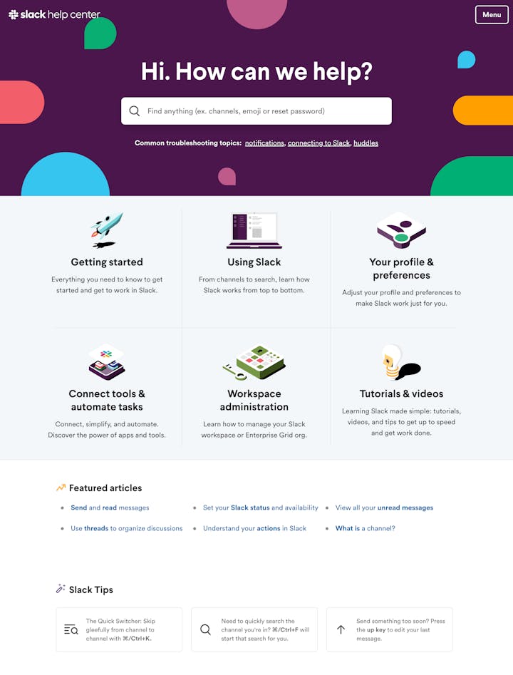
Slack's Help Center is well-structured, making it easy for users to find solutions to their queries quickly. It delivers an organized platform where users are guided through a coherent flow of information, from broad topics to specific sub-issues. The page particularly stands out thanks to its interactive design, detailed solutions, and effective visual aids.
Key features:
Self-serve user guides: These guides offer step-by-step instructions about using Slack effectively to answer user questions.
Intuitive search functionality: Users can leverage the search bar to find precise information about their specific questions.
Organized topics: FAQs are categorized systematically, aiding a seamless navigation experience.
Helpful video clips: For certain topics, short videos are integrated giving users a visual demonstration of tasks.
Community forum access: Users can connect with the Slack community to share experiences and seek advice.
9. Airbnb
Airbnb is a global marketplace that connects travelers seeking unique accommodations and experiences with hosts offering shared spaces, homes, or expert-driven activities.
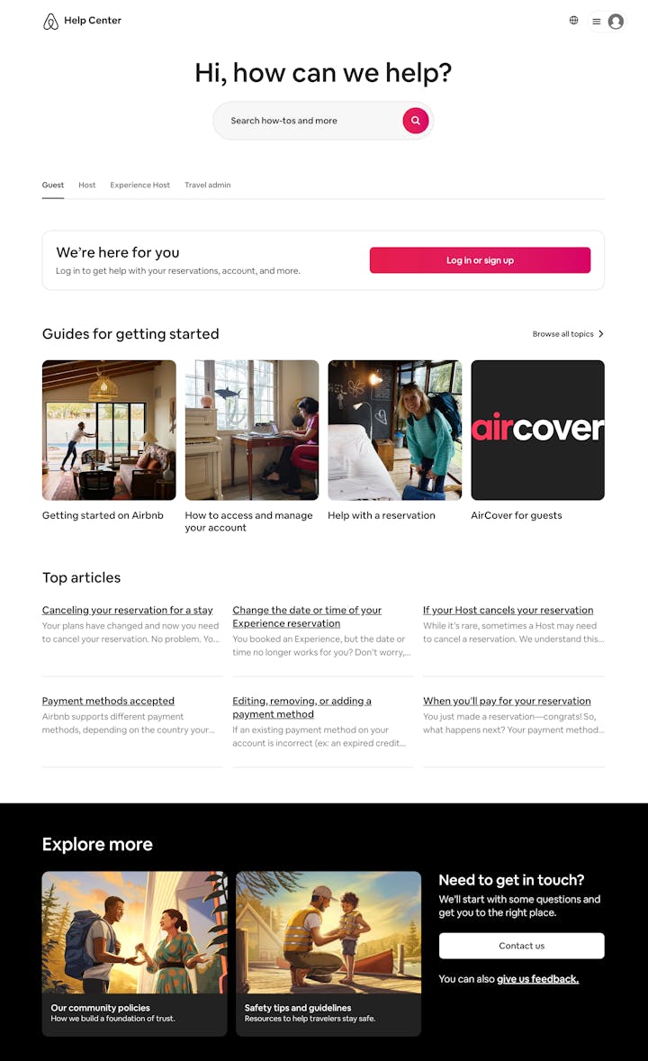
Airbnb's FAQ page effectively caters to several different user segments: guests, home hosts, experience hosts, and business travel admins. Its segment-specific approach ensures the delivery of personalized and pertinent information. The page is designed with a user-friendly layout, quickly guiding visitors to their relevant FAQs with answers in the form of comprehensive guides complete with examples and alternate scenarios.
Key features:
Segmented FAQ pages: The help section is divided into “Guest,” “Host,” “Experience Host,” and “Travel Admin,” with targeted support for each group.
Search functionality: Users can leverage a search bar for quick, specific inquiries.
Comprehensive answers: Airbnb provides detailed responses, coupled with probable scenarios and examples.
Accessibility to relevant resources: Frequently, the answers are coupled with links to relevant articles for additional assistance.
10. Trader Joe’s
Trader Joe's is a renowned chain of grocery stores in the U.S. known for its unique product selections and themed store setup emphasizing quality goods, affordable prices, and a friendly, customer-centric environment.
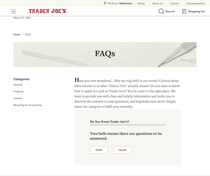
The standout feature of the Trader Joe's FAQ page is the intimate touch it places on delivering solutions to user queries. The platform feels more like an informal conversation rather than an information database, echoing the brand's customer-oriented philosophy. It is easy to navigate with clearly defined categories addressing concerns spanning from general operations to specific need areas. Detailed answers are worded in a friendly, uncomplicated manner, staying true to Trader Joe's commitment to a personalized shopping experience.
Key features:
Categorized questions: FAQs are sorted under “General,” “Products,” “Careers,” and “Recycling & Composting” for easy access to information.
Interactive component: The FAQ page incorporates a fun quiz question, adding a playful, interactive element.
Friendly tone: Answers are provided in casual, simple language, mirroring the brand's approachable style.
Clear navigation: The page is outline-designed and straightforward, making it a breeze for users to find what they are looking for.
Accessible format: Borrowing from the overall website's aesthetics, the FAQ page is well-designed, making readability easy for users.
11. REI
REI is a trusted outdoor retailer that offers high-quality gear, apparel, and experiences for a broad range of activities. The company is known for its extensive product offerings, outdoor stewardship, and commitment to customer satisfaction.
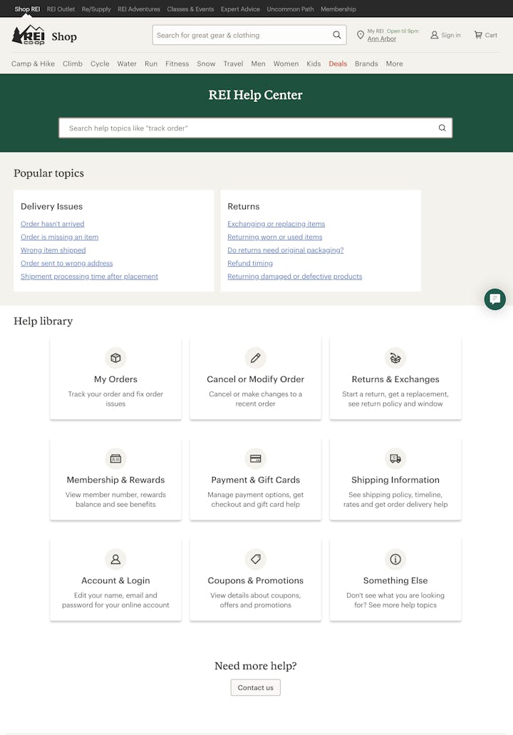
REI's FAQ page is designed to reflect its user-centric philosophy. The breadth and depth of information provided are specifically fashioned to cover a broad spectrum of customer queries, ranging from orders and returns to expert advice on outdoor gear and activities. The FAQ page maintains an efficient structure, allowing visitors to navigate through different sections effortlessly. REI's commitment to customer satisfaction and trust is evident in its comprehensive, clear, and easily understandable responses to common customer queries.
Key features:
Polished organization: The FAQs are grouped under relevant headings like “My Orders,” “Cancel or Modify an Order,” and “Returns & Exchanges,” facilitating easier navigation.
Search bar: A prominently placed search bar allows users to type in specific inquiries for immediate access to information.
Ease of use: Information is presented in a clear, easy-to-digest format.
Helpful links within FAQs: Many responses contain links directing to related topics or detailed articles, enhancing the informational depth and context.
12. Zoom
Zoom is a leading software platform for enterprise video communications, providing a seamless, reliable, and innovative solution for video meetings, conferences, and webinars.
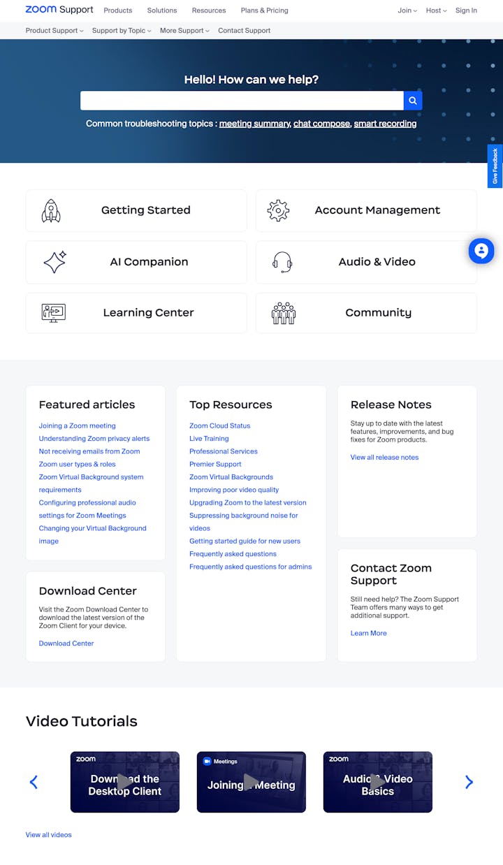
Zoom's FAQ page shows a clear understanding of its users and their potential concerns, making it distinctly user-driven. The questions are sorted based on frequently-occurring usage scenarios, covering a diverse range of topics from setting up an account to troubleshooting video issues. Each answer is easy to understand and includes details to provide help and pertinent answers. Even the most technical responses avoid using jargon, enabling users of all technical levels to leverage the platform to its fullest potential.
Key features:
Scenario-based FAQs: Queries are grouped based on common usage scenarios for intuitive browsing.
Detailed responses: Each response is thorough and explores the query in depth.
Jargon-free language: Despite the technical nature of the platform, answers are conveyed in an accessible tone.
Relevance: The FAQs cover a broad range of critical and relevant topics to Zoom users.
Helpful links: Many responses feature links directing to more detailed articles, tutorials, or related topics.
13. Uniqlo
Uniqlo is a popular and innovative Japanese apparel brand, known for its commitment to providing high-quality and functional clothing. Uniqlo's carefully designed products, ranging from casual wear to technologically advanced apparel, serve the daily needs of people worldwide.
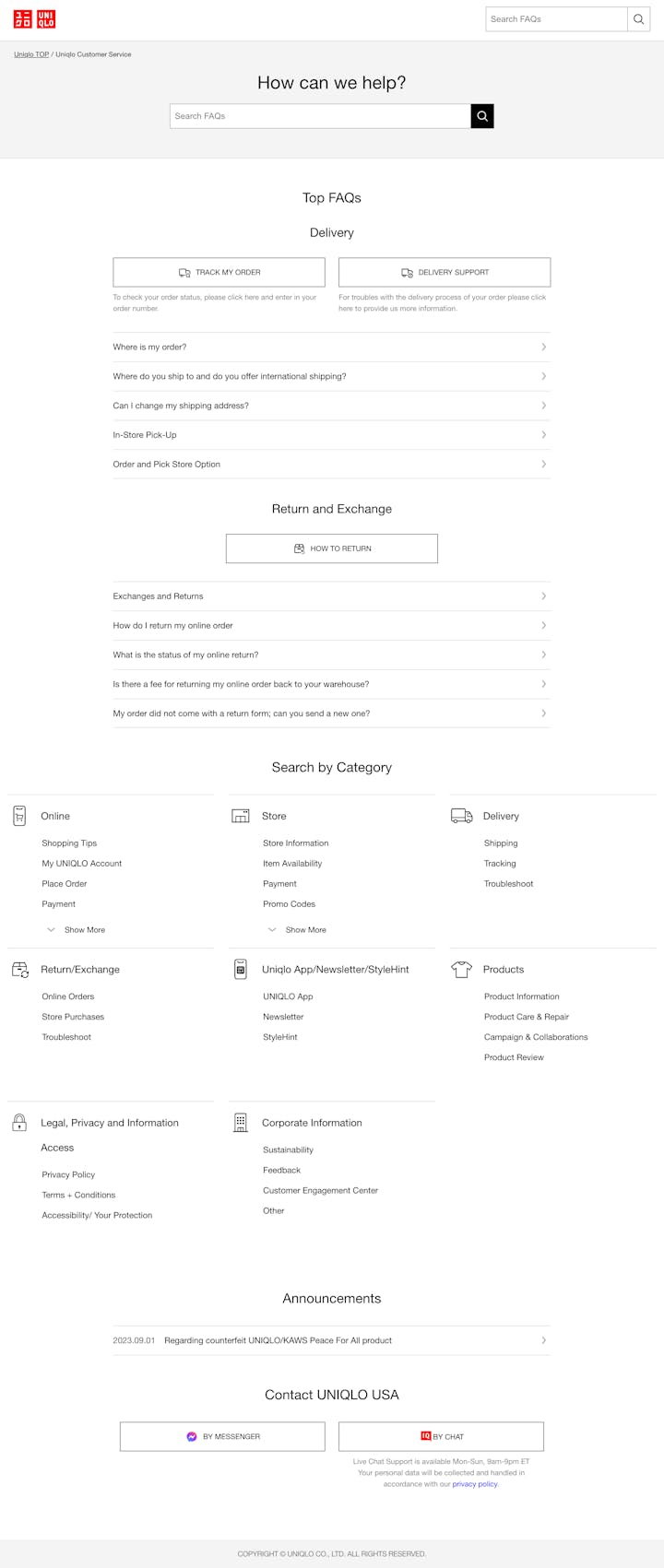
Uniqlo's FAQ page is constructed as an easy-to-navigate hub, starting with the option to search for specific queries right at the top. Different sections, such as “Delivery” and “Return and Exchange,” are organized in a clear manner, each housing a list of FAQs pertaining to the section. Answers include not just textual explanations, but also pointers to assist customers. We really love the “Announcements” section, which shares important current information with users.
Key features:
Search functionality: A search bar is positioned on the top of the page for ease of use.
Section-wise organization: The FAQs are strategically categorized into various sections like “Top FAQs,” “Online,” and “Uniqlo App/Newsletter/StyleHint.”
Comprehensive answers: Detailed responses in an easily understandable format cater to customers' queries.
Announcements section: This is a unique addition that keeps customers updated on important updates or issues.
User-friendly interface: The FAQ page maintains Uniqlo's clean, minimalist aesthetic, ensuring a pleasant user experience.
FAQ page best practices
Crafting a compelling FAQ page goes beyond answering common questions. It's also about presenting information in a user-friendly manner that supports navigation and understanding. By adhering to a few key best practices, your FAQ page can become a valuable source of information for your customers as well as a strategic tool to offer high-quality customer service, reduce customer service inquiries, and enhance overall customer satisfaction. Here are some best practices for creating an effective FAQ page:
Organize by relevance: Present your FAQs in a way that directly reflects their usefulness or topicality. The most common questions should appear at the top.
Focus on actual FAQs: Begin by gathering the most commonly asked questions from your customers based on your customer service interactions. An FAQ page filled with actual FAQs will be more relevant and valuable to your audience.
Provide in-depth information: Don’t shy away from providing detailed and comprehensive answers. Detailed information helps ensure that your readers’ questions are fully answered and reduces the need for them to reach out for further support.
Group similar questions: Improve your page's navigation by categorizing related questions together. This will make it easier for users to find and digest information.
Use clear and concise language: Avoid complex jargon and industry-specific terminology. Your FAQs should be written in clear, straightforward language that’s easily understandable for all readers.
Use a natural language structure: Frame your questions in a way your customers would ask them. This makes them more relatable and easier to understand.
Leverage customer feedback: Customer feedback can cue the most frequently asked questions or highlight areas requiring improved clarity.
Link to relevant content: If a question requires a detailed answer, link to a blog post, guide, or tutorial for more in-depth information.
Cross-link relevant FAQs: Provide links between related FAQs. This helps in guiding the customers and providing a more thorough understanding of the topics.
Update regularly: Make sure your FAQ page is current and accurate, updating it regularly based on new product changes, policies, or common customer inquiries.
Include search functionality: As your list of FAQs grows, having a search function can help users quickly find the answers they need, enhancing their experience and potentially reducing the need for further customer support.
Use a friendly tone: Although your FAQ page is informational, it should still reflect your brand’s tone. A friendly, conversational tone can make it more engaging.
Add visuals if needed: Images, infographics, or video tutorials can often clarify an answer more succinctly than a wall of text. Many knowledge base tools allow for the embedding of relevant images and videos.
Add contact information: If users can't find an answer on your FAQ page, ensure they have an easy way to get in touch with your support team. You could include your contact info in your footer or link directly to your contact page.
Drawing inspiration from FAQ page examples
A well-constructed FAQ page can not only take some of the burden off your customer service team but can empower your customers with immediate answers to their common questions. Drawing lessons from the best FAQ examples and adhering to the outlined best practices can guide you on your path toward creating an effective FAQ page that becomes a user-friendly repository of valuable information.
The Supportive Weekly: A newsletter for people who want to deliver exceptional customer service.

