Making (and Breaking) the Help Scout Brand


Over the past seven years, Help Scout has grown and evolved through different fonts, logos, illustration styles, and color palettes — everything that comes together to create the foundation for a company’s visual brand.
A company’s overarching brand is so much more than a few design elements coming together, though — it’s the way people feel about your business; it’s the thing that sets you apart from your competitors. It can be something your customers rally behind, or a vision your employees truly believe in.
Consistently exercising on a few core values can make — or break — your brand for your customers. A few too many inconsistent messages, and you might lose their trust. But proven dedication to a purpose or cause can create a loyal base of loving followers, and that’s the goal of any growing company.
Try the customer support platform your team and customers will love
Teams using Help Scout are set up in minutes, twice as productive, and save up to 80% in annual support costs. Start a free trial to see what it can do for you.
Try for free
Why it was time for a change
Companies grow over time, and so do their products, values, and technology.
Technology moves quickly, and our tastes (whether we realize or not) change just as fast. When you look at Windows 2000 or pick up a first generation iPhone, you instantly feel like you’re visiting a relic from the past. It feels retro, and it’s kinda funny to look at. When technology is built to last, its growth and transformation over time has to stay almost under the radar, without anyone noticing too much. It’s not easy! But it’s important to stay relevant and to remain aligned with your goals and values as they inevitably evolve.
So how do you stay consistent with your messaging while staying relevant in an ever-changing industry?
You may have noticed that Help Scout has been trying on some new clothes lately. We have new illustrations on our site, we use a whole new font, and we’ve changed every color everywhere. Even if you haven’t noticed those details, you may have noticed things are starting to feel a little different.
That, right there, is a brand growing up right in front of your eyes! It’s vulnerable, it’s scary, and it’s awkward sometimes. But it’s important that we continue to evolve and to express that evolution as consistently and as consciously as we can.
These changes might seem arbitrary and unnecessary sometimes, so we want to pull back the curtain on this process and show how we make these decisions.
Listening to feedback
People don’t always love big changes, and nobody knows this better than designers. It’s a lot of pressure on a team to take a pre-existing design system that’s already proven to work, and to change it, for (what appears from the outside) no reason at all.
Some changes are necessary, and some are risks we’re taking … but all changes are made in the pursuit of creating a better product experience for our customers. We don’t always get it right, though.
When we recently adjusted our color palette from #22A1F0 to #1292EE, we received several support requests to change it back within only a couple of hours. After researching our customers’ concerns, we realized the change had made our product less accessible for people whose vision is impaired. So we fixed it!

We also changed our illustration style recently (more on that in a bit!), and while most people responded positively to those changes, others didn’t love our new look. In that case, we decided to stick with our choice because we feel it represents who we truly are right now.
Defining our values
During this past year we realized that the brand that we had looked perfectly fine, but something wasn’t sitting exactly right. It didn’t boldly express the values we hold internally as a company. It felt a little too robotic, sterile, and even cold. Our illustrations, while bright and colorful, lacked a human element and felt too structured. Our page layouts felt safe and expected, but they didn’t tell a story about how our product could enrich people’s lives. Overall, as a company we felt like we were warm and happy to help people, but the brand represented on our website could have essentially stood in for any other company. If a brand establishes an opinion and a point of view, then the point of view we were representing no longer matched who we were at our core.
It was time to do some outward realignment. In other words: a rebrand. (Queue dramatic music.)
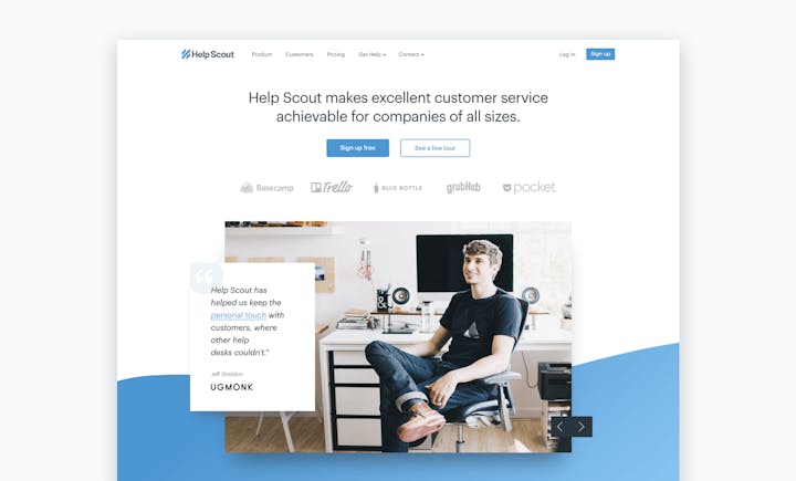
The first step was to start from where we were, with the resources we had. We didn’t have the budget to outsource the project with a giant design agency, nor did that kind of process align with our values. We care a lot about the product we’ve built, and we’ve established a close relationship with every pixel and tiny detail — so it made sense for us to stay as closely involved with the rebrand process as possible. While we didn’t know where we wanted to end up, we knew our illustration style needed to evolve. So we decided to start there, by digging into our values as a company.
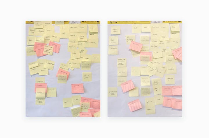
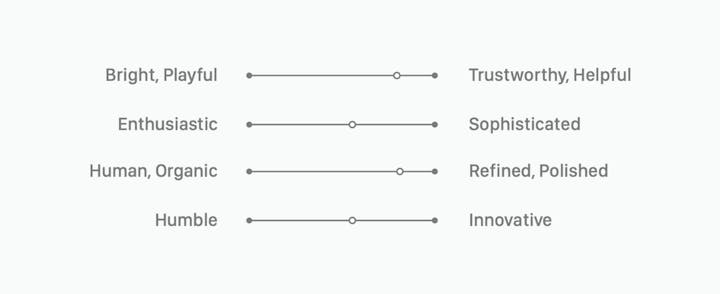
We worked with illustrator Alice Lee to set our North Star. After a sticky note session during one of our in-person retreats, we decided Help Scout is:
Trustworthy, but not Sterile
Helpful, but not Overbearing
Energetic, but not Ecstatic
Human and Organic, but still organized
Innovative, but we don’t take ourselves too seriously
We had some words! So it was time to begin.
Taking an illustration-first approach
Our original illustration style wasn’t broken. We liked these images! And our customers did, too. Since we knew we’d potentially be changing things that our customers loved, we wanted to make sure that in their place, we gave them something that felt right.
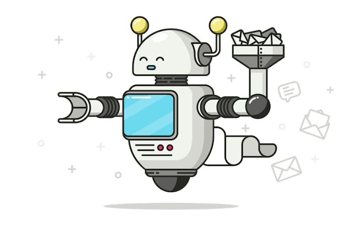
Our old illustration style mirrored our product values by being clean and straightforward, but with our new list of values, it was missing a few marks. We needed a brand that fell in line with our company values — the benefits we want to bring to people’s lives by using our product. We needed to define a more human element — a deep feeling of trust you get from an unexpected act of helpfulness.
So Alice started to work on some mood boards with us:

We looked at all sorts of illustration styles to start the conversation about who we were and, more importantly, who we weren’t.
If something was too loose, why did that matter to our brand? If something had too much energy, what did that mean for Help Scout? Bright and colorful illustrations were fun, but they made themselves too prominent, and therefore too distracting, to vital information in a setting that needed to be efficient and productive. If an illustration felt a little too “hip,” would that make us feel less approachable to our customers?
Never underestimate the power of a mood board. These conversations gave us and our illustrator a lot of clarity on which direction we were headed and why.
After our first mood board conversation, Alice built a scale for us to reference as we assessed different styles. She was able to pick up a pattern and to dial in the formula Help Scout was gravitating toward.
As Alice felt we were getting closer, she started to place the mood board artwork into our branded environment to see how these things played together.
Seeing these illustrations embedded within our brand was incredibly helpful, and we started to have more nuanced conversations about what Help Scout could look like, so Alice set out to give us our first original take on our illustration style.
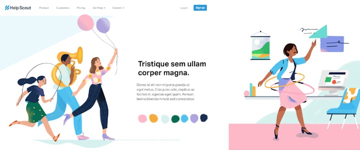

Basically, Alice nailed it on her first try. We fell in love with this style. We looked at this and felt like we were seeing Help Scout — the feeling we want people to have while they’re using our product. It was fun and human, and it left room for playfulness while remaining efficient and showing a world in which people could get their best work done.
We put a lot of thought into the types of people we wanted to represent (all of them!), what kinds of expressions should be on their faces (complex ones), how colors and shadows could work together, and what objects would look like in this world. We used our new brand values to develop the right feeling in every detail of our new brand. No moment was too small to wonder, “How will this look in the Help Scout universe?”
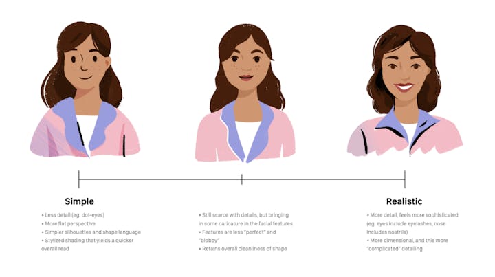
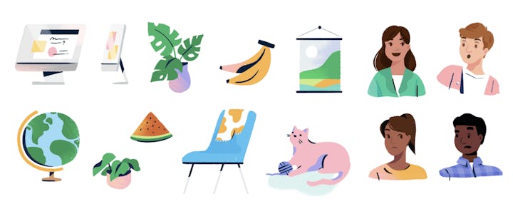
How could we represent the faces of our customers and our team? What do people feel like when they’re communicating with their customers through Help Scout? They might be excited, confused, worried, or even stressed out at times. Customer support teams are certain to face all of these emotions at some point, and we didn’t want to be shy about that.
This might seem like a lot of talk about pictures and colors, but this exercise showed us who we really are, deep down. We were creating a shared understanding at a high level. We met consistently with our CEO, COO, Head of Sales, and Head of Support to talk about what we’d been discovering, and we included them all in this conversation. It was a group effort.

Read about this process from Alice’s perspective, and learn more about the process of building an illustration style.
Building out the brand
Now that we had a good idea of where we were headed, we decided to get started on our marketing site. Helpscout.net (now helpscout.com!) hadn’t been overhauled in a while, so this was a great opportunity. The Help Scout site had been designed well and it was performing well, but now that we were beginning to understand our new visual world, we started to see opportunities for improvement, even if it was scary to take those initial steps. We did some sketching, and we talked about the kinds of scenes our site should illustrate. Customer interactions were important to show, but how? In what kinds of environments — real, virtual, a bit of both?
Help Scout is a tool that brings people together — even people who might never meet in person — so we decided to allude to the idea of separate worlds colliding, in a way that felt human and meaningful.
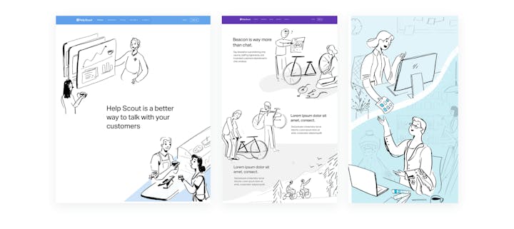
This is where the true rebranding work began. All of the other details dovetailed with the marketing site changes — we experimented with a number of typefaces, for example. While we loved some more than others, we ultimately landed on Graphik.

We tried several different typefaces with Alice’s illustrations in context to get a feel for how they would work together.
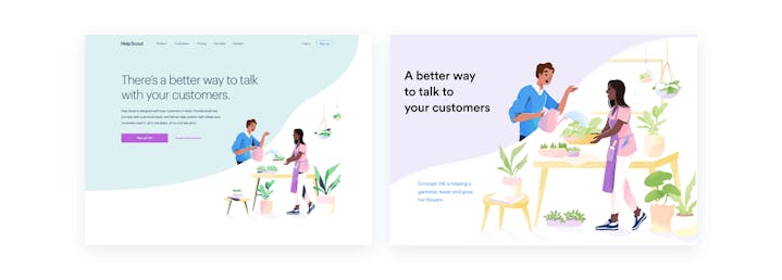
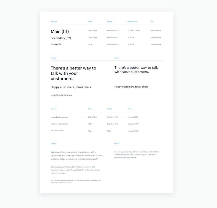
Once we chose a typeface, we got to work on some universal elements that would run across our site, such as our typography, navigation, and footer:


While the brand team worked out these universal elements, the product design team began developing a more efficient way to manage components across the product. The brand would have to transition into the product, but in the least disruptive way possible (since that’s where our customers had to actually get their work done). We set up a process for creating and implementing changes, and we’re still rolling those out.
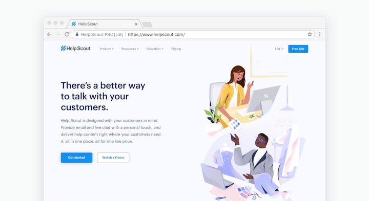

We had now built a world that felt like us. We loved how human it felt and how diverse and approachable this world looked.
Despite a few bumps in the road, the process only took five months. Given the scale of the project, that’s a pretty quick turnaround — the secret sauce was our internal team’s dedication to getting it right.
Where we’re headed next
Defining a brand is relatively easy. The hard part comes when you’ve established all of those rules and clearly discovered the formula for who you are — then you remember your company and customers keep changing, and your brand has to grow with you along the way.
As soon as you’re done celebrating a big rebrand, things go and evolve again. Technology advances, features are built. Time has a funny way of changing things, and Help Scout is no exception to this rule. We’re growing to a company of more than 90 people this year, and with those new faces we’ll gain new features, new stories, new tools, and new feelings. Conversely, other people will leave, and we’ll misstep here and there, make mistakes, and learn from them.
Just like people, brands go through a mix of successes, failures, and new beginnings. We’re going to do our best to grow alongside our product, our vision, and our people. We’ll change our clothes from time to time, and we’ll probably even look a little different a year from today! But we’ll always do our best to stay true to who we are.
The Supportive Weekly: A newsletter for people who want to deliver exceptional customer service.
