Building a Newsletter Welcome Series from Scratch


Trusting a company with your email is a meaningful step. The gesture should elicit sincere enthusiasm, but too often it’s met with indifference.
We wanted better for our readers. With monthly sign-ups growing nearly 9x since last summer, we’ve seen thousands of new faces joining the Help Scout blog and newsletter.
The question became how we could use email to enhance the experience in a way that aligned with business goals. Our answer was a newsletter welcome series.
We’re learning a lot as we go, but I wanted to share the thinking behind what’s currently in place.
Try the customer support platform your team and customers will love
Teams using Help Scout are set up in minutes, twice as productive, and save up to 80% in annual support costs. Start a free trial to see what it can do for you.
Try for free
The messaging timetable
To start off, start small. As our first autoresponder sequence, we opted for a brief series of five emails, following the schedule below.
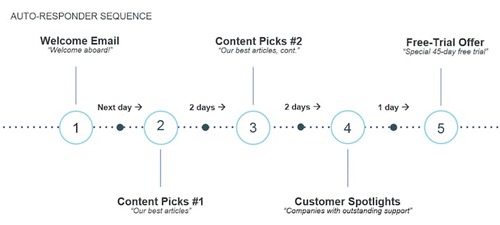
Beginning with “Welcome aboard!,” readers receive the emails over a course of seven days, weekends included.
We went with a clean, uncomplicated look that’s reminiscent of plain text, but that still allows for some branding.
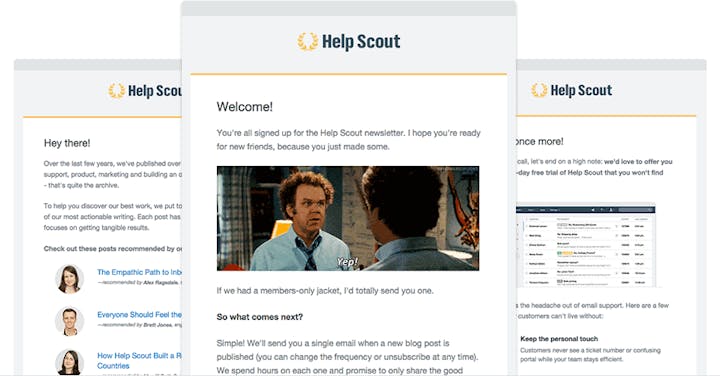
That’s the truncated summary, so now let’s take a look at each email individually.
1. The welcome wmail
The subject line
Welcome aboard! (please read)
Short and sweet, with the noticeable addition of “please read.” This is only a hunch, but I saw an improvement in opens when I tested this for another newsletter. Readers may skip these emails because they’re used to seeing “Thanks for signing up!” with no additional information. A small nudge may help fix that.
Goal of this email
In researching ideas and inspiration, I signed up for a lot of company newsletters. I say this kindly, but many welcome messages fell into two camps:
They pushed too hard for a sign-up in the first email. I didn’t feel welcomed, I felt sold out (and I know that wasn’t their intent).
The message said nothing of substance. There was no objective and zero reason for the email to be sent.
The goal cannot be vague; “marketing” is not justification for an email to exist. Ours has two purposes: setting expectations and a friendly introduction.
We want you to know what you’re getting with these emails. “What happens now?” is the question on your mind, so that’s explained.
We also want you to know who we are without clogging your inbox with irrelevance. We kept it light, opened with a joke, and put a single link to our about page if you want to learn more.
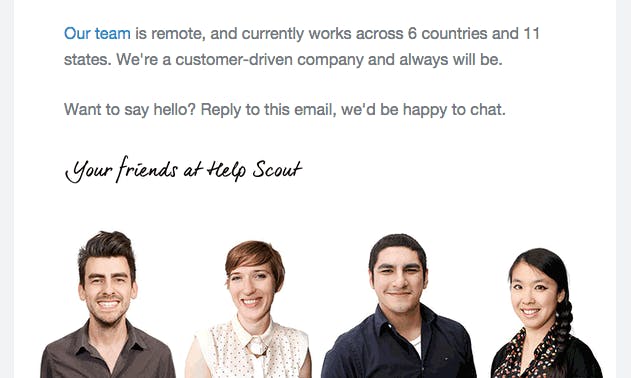
One detail I personally love is the invitation at the bottom to talk to us. Too often newsletters feel like one-sided affairs instead of reaching their full potential as an ongoing dialogue.
It’s early, but this simple suggestion has helped start more conversations, and we hope it encourages many more.
Suggestions
This is where you set the tone, both for what’s to come and who it’s coming from. We’re fond of Mailchimp’s “fun but not childish” approach, so our introduction made that clear.
If ever there is an email to include photos of people, this is the one. People like being greeted by other people, automated message or not.
2. Curated content – part I
The subject line
Start here: our best writing on support, product, and more.
This is the true start of our series. The subject line states that our best writing is included, because what’s inside is a curated list of popular articles.
Goal of this email
Your aim above all else is to be helpful to readers. Handpicking popular posts saves time and gets them right to the good stuff.
It’s comically easy to lose the personal touch here, so approach with care. Many newsletters “drip” content, but they’re formatted as blocks of text that feel thrown together and mechanical.
We were curious to see if recommendations could be used to augment the design from plain to personable.
With teammates involved, your email puts a face to the name, in addition to highlighting your top-shelf work. Here was our approach for getting the best of both worlds:
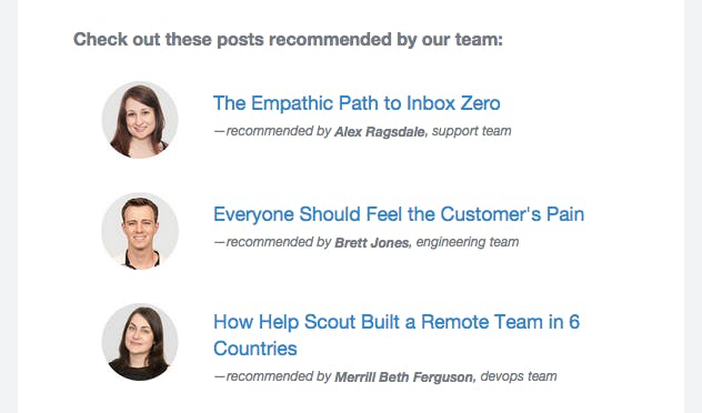
It’s nice to see that a real person enjoyed the article you’re about to read.
For topic selection, we were considerate of what Help Scout customers enjoy and share most often. Popularity doesn’t define your best work, but it’s a good place to start.
Suggestions
Track clicks on every link so you can find out which articles and callouts garner the most attention.
When you associate writing with different people/positions, interesting combinations can form. A co-founder sharing a post on user onboarding speaks directly to other founders, a large portion of that article’s intended audience.
Don’t let this area become visually cluttered. When there’s too much to see/click, inaction becomes the default action.
3. Curated content – part II
The subject line
5 more blog posts you don’t want to miss.
Any email in a curated content chain is directly impacted by the previous one. Did people enjoy what they read last time? If they did, you can speak plainly: “Here’s more good stuff.”
Goal of this email
A universal challenge in curating is the balance between variety and volume. How many content focused emails should you send? How many links in each email?
We went with five posts and two emails. Ten articles gave room to offer something for everyone, and two emails didn’t strike us as overwhelming.
Be sure to complement the content of earlier emails; don’t repeat them.
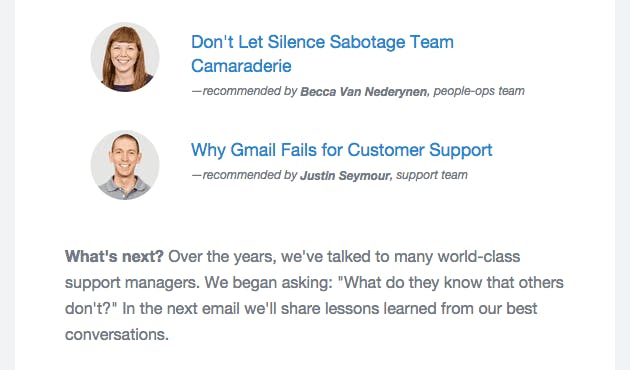
We’re currently experimenting with a “What’s next?” section at the bottom of each email.
Previews can create enticement, but they can just as quickly extinguish it. The reaction you get is a result of the words you choose, so if you’re going to close with a sneak peek, close with gusto.
Suggestions
Consider your personas when curating recommendations—if one group engages with your content most often, focus on them. There’s no need to appeal to the customer who doesn’t read newsletters.
In the reader’s mind, “What’s next?” actually reads “Why bother?” Offer incentive or lose them for good.
Think about the “jobs” that your best content performs. Do you have a piece that says a lot about your culture? Do you have a piece that makes your product look like the painkiller that it is? Make recommendations based around what you want to project.
4. Customer success stories
The subject line
What successful companies know about customer support.
Customer stories are attractive because they show the means and measures of companies who are getting results. Wouldn’t you like to know how they work?
Goal of this email
In a series of five emails, the fourth is a late-runner. When the upcoming finale is an offer to try your software, you need to remind readers beforehand of what your product does and why the results are worthwhile.
Spotlights are a solid way to do both. There’s an opportunity for a well-told customer story to transcend “case study” and be of use for everyone. The added bonus is that you’re showcasing customers who are succeeding with your product.
Our fourth email features a handful of our customer stories with callouts for the company and the interviewee.
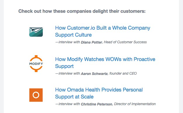
We have a wide variety of customers in software, ecommerce, and online services, and readers from each vertical, so we featured a mix of all three.
Suggestions
Success stories are great for addressing points of inertia. Where do customers have objections or hesitations when switching to your product? Which stories do you have that best address this, and for which verticals do they matter most?
Remember that the interviewee’s title may speak to a potential customer who’s responsible for signing up. In B2B, consider including who is behind the story.
5. The Special Offer
The subject line
Special offer: Try Help Scout free for 45-days!
We include a mention in the previous email that a little surprise is headed your way. We want to leave nothing to the imagination in the subject line, so we went with clear over clever.
Goal of this email
Truthfully, there was some initial hesitation to include a final email with a “pitch.”
However, we are in the business of software, not newsletters. After seeing a few of the good guys handle similar offers with tact, we were convinced to give it a go.
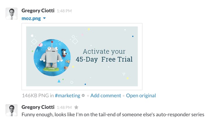
Anyone who has made it this far may have some passing interest in your product.
However, you shouldn’t assume that a closing email in a welcome series will have a “one and done” effect of open --> sign-up. This is content-based; it takes time.
The soft benefit is that even if subscribers don’t sign up immediately, you’ve sent a message that clearly explains how your software can help. When they need it, they’ll remember you.
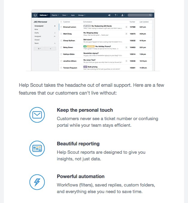
This is the email I can offer the least advice on, with good reason.
Conversion advice without context is often nothing more than bikeshedding; obsessing over the minutiae and could-be’s is rarely productive. You know your customers and you know the outcomes that sound like success to them. State that as plainly as you can, then make it easy to sign-up. That was our approach.
And that’s that! We’ll continue tracking results and talking to subscribers to make the experience even better as time goes on. For now, we’re excited at the opportunity to give our readers the warm welcome they’ve always deserved.
The Supportive Weekly: A newsletter for people who want to deliver exceptional customer service.