10 Proven Ways to Build a Website that Customers Will Love


While it can be a tough balance to achieve, creating a functional, streamlined and well designed website is well worth the effort.
Fortunately, improving your customers’ experience with your site coincides with improving your bottom line. One study even revealed that a website’s design is most likely to affect its presumed trustworthiness—not the content that lies within.
Today, we’ll look at some proven strategies for building a website that customers will love to use ... and buy from.
Let’s get started!
Try the customer support platform your team and customers will love
Teams using Help Scout are set up in minutes, twice as productive, and save up to 80% in annual support costs. Start a free trial to see what it can do for you.
Try for free
1. If it’s Important, it Should be Obvious
While it’s not necessary to keep every little thing “above the fold” (more on that point later), it is important to create a site that correctly prioritizes key pages.
In a humorous take on doing this wrong, xkcd points out how miserable it is to browse most university’s homepages:

In a common example, think back to a time that you visited a restaurant homepage that didn’t have their hours listed or that hid the phone number for reservations all the way at the bottom of the page.
Try viewing your site from a customer’s perspective, and apply the KISS principle to avoid clutter and needless navigation.
2. Give Customers Closure
Human beings have a natural inclination to seek closure.
This trait even applies to the purchase of new products. According to a new study from the Journal of Consumer Research, consumers feel more satisfied with their purchase if they get a sense of closure after the sale is made.
The idea of closure is a bit muddy to describe, but the authors of the study point to clear cues that indicate that the deal is done and other options are no longer a concern. Perhaps the best way to illustrate the study’s findings is with the use of this terrible example:

Hopefully this is one of the worst user experience and copywriting fails you’ll see this week. The image above showcases an awful way to close a deal; it’s ambiguous, impersonal and just downright confusing.
For all of the aspects of your site that can be “finished” (e.g., purchases, contact forms, etc.), make it crystal clear that the process has been completed and a customer is all set.
3. What’s the Best Color for Conversions?
The argument over which color is best for conversions is a silly one.
Red, orange, green—there’s never a consensus. A color’s ability to affect conversions has far more to do with context than the color itself. This statement is supported by cognitive research, specifically a phenomenon known as the Von Restorff effect. In layman’s terms, the effect predicts that whatever stands out gets recognized and easily recalled, and what blends in gets ignored.
So when you come across A/B tests like this one, you should recognize that one color only outperforms the other because it stands out.

It’s better to create a visual hierarchy for your site, as explained by StudioPress and illustrated below:

You can utilize “action colors” to denote when a customer should click, allowing you to distinguish your important buttons and links from your unimportant ones.
4. Apply Fitt’s Law
The use of Fitt’s law in web design may seem like common sense after you read about it, but many small business sites don’t seem to put it into practice.
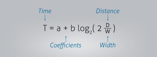
The mathematics behind Fitt’s law make it seem complicated:

But the main takeaway is that the larger a target object is and the closer it is to a user’s start point, the easier it is to use and the more attention it will draw (duh!).
You can improve your website’s usability with Fitt’s law by making the most commonly used buttons bigger than others (thereby ranking them more important in the visual hierarchy). You can also improve your calls to action by making the most important element the largest and the easiest to access.
It makes sense that Unbounce would have the equivalent of their “Try Us” button be larger than other options such as “Log In” or “Landing Page Examples:”

5. The Power of Large, Concise Headlines
According to data from Eyetrack III, a study that looked at web usability, headlines are consistently the most viewed items on a web page ... even over images!
Headlines attract eyeballs because users want to see exactly what the page is about (qualifying if it’s what they want). Bold, concise headlines give them that information up front.
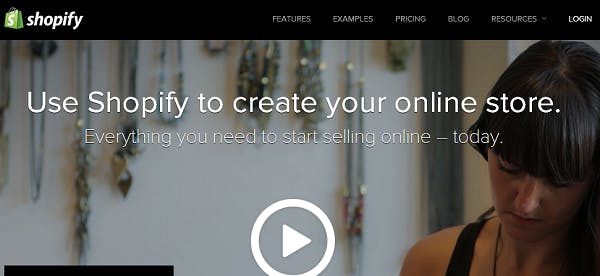
You’ll notice this design trend is becoming common on the homepages of many companies:

Far from just being a marketing tactic, headlines let you really give users what they want. You save everyone time by letting customers know from the start if your product is a fit for their needs.
6. Use Plenty of White Space
According to the research from Eyetrack III and Susan Weinschenk’s book Neuro Web Design, white space is incredibly important for reading comprehension and creating contrast with your other on-page elements.
In fact, this study shows that when you decrease white space from the margins, reading comprehension drops drastically.

This applies to every place on your site that is text-heavy—blog posts, product descriptions, landing pages. Make sure your typography is well spaced and easy to read (14 is the new 12!) so that customers can easily consume and digest your persuasive copy.
7. Incorporate Directional Cues
According to results from the appropriately titled study Eye Gaze Cannot Be Ignored (But Neither Can Arrows), we simply cannot resist following the line of sight of both another person’s gaze or a directional arrow.
Consider the results from the test below, which uses a photograph of a baby next to some body copy:

You’ll notice that your gaze naturally focuses on the baby’s face; in fact, it dominates viewing time and is easily the most viewed item on the page.
The next test used a picture of the baby looking in the direction of the text:

Now we can see that the face initially attracts the eye, but then our attention shifts over to where the baby is looking. If you can’t incorporate a human face into your web design, remember that directional arrows and other visual cues also worked quite well!
8. The Persuasive Power of Social Proof
Prospective buyers want to know that they can trust you.
There’s no better way to convince them than with social proof in the form of customer testimonials and reviews. But remember that social proof should only be used after you’ve made your case for why your product may be a fit for them.
Closing landing pages with reviews or placing a testimonial next to a “Buy Now” button are subtle ways you can incorporate this powerful persuasion element where it matters most.
9. Limit Options for Increased Interaction
When it comes to production selection on your site, the phrase “less is more” actually rings true!
In the insightful study When Choice is Demotivating, Columbia University professor Sheena Iyengar tested the effects of product options at an upscale grocery store by setting up two different displays of jam.
The first display showcased 24 flavors
The second display showcased 6 flavors
While the larger display attracted more peruses, only 3 percent of people actually bought something ... compared to the 30 percent of people who bought something from the 6-jam display!
Iyengar concluded that too many options can result in “action paralysis,” or not knowing what to do next. The result is to instead choose nothing.
As an affirmation of this study’s findings, you’ll notice that on sites like Amazon the “Customers Also Bought...” section only lists seven items at a time (although it often scrolls to 40 or more pages!).
Be wary (especially if you are an ecommerce store) of your site bombarding people with too many options on any individual page; this could lead customers to ultimately take no action.
10. Make Sure Your Site Loads Fast!
Nobody likes a slow site ... but the impact site speed has on your customers’ experience (and subsequently, your sales) is quite drastic.
Get ready to lose some sleep at night: According to a report by Bing on O’Reilly Radar, a less than 2-second increase of delays in page responsiveness reduced user satisfaction by 3.8 percent and increased lost revenue per user by 4.3 percent.
What could a 4.3 percent drop in revenue do to your business?
By including only the essential on-page elements (as discussed above), using caching and paying for premium hosting, you can ensure that page loads aren’t slowing down your earning potential.
Bonus: Don’t Fear “The Fold”
One of the biggest design myths when it comes to the customer experience is the belief that everything important must be squashed “above the fold” (what the user sees before they scroll).
Multiple tests (including this one and this one) have shown that users have no problem scrolling down below the fold. Surprisingly, they’ll actually browse further down if the length of the page is longer:

So don’t be scared to give detailed product descriptions or use a long-form landing page for your service ... just be mindful to utilize smart spacing.
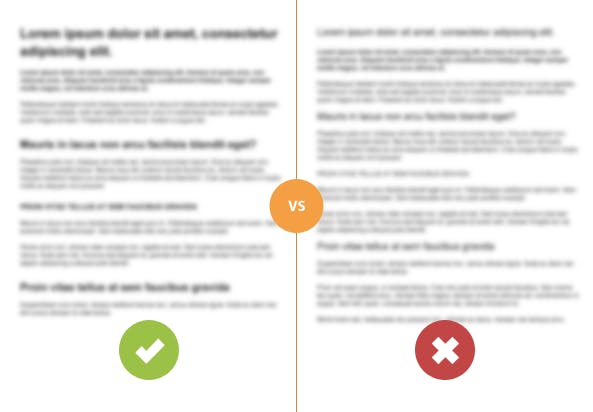
According to this study, you will lose a few people on long copy pages no matter what you do, but you can reduce this effect by breaking up paragraphs and adding more headlines like the ones below (image courtesy of Rafal Tomal):

Still worried about using long landing pages? Consider the results from an A/B test recently conducted by Neil Patel, VP of Marketing for KISSmetrics.
Patel pitted a page with 1292 words against a page with 488 words and found that the longer page converted 7.6 percent better than the above the fold variety:
And it didn’t just end there, the leads from the long form version of the page were higher in quality than the leads that came from the new variation.”
Bottom line: When long pages are done correctly, they can result in more qualified customers being persuaded to purchase your products and services.
The Supportive Weekly: A newsletter for people who want to deliver exceptional customer service.