How to Build a Brand that Wins Over Customers’ Hearts and Wallets


Branding has an interesting dual nature that makes it both an advantage and a disadvantage for the little guy.
It’s well known that despite what we’d like to believe, brands people hate can still succeed. Why? They’ve reached an event horizon, usually with their immense size, that allows them to offer things that smaller companies just can’t do.
There’s a simple explanation for how brands people dislike endure: consumers will continue dealing with a brand they don’t like if other advantages are significant. People will tolerate bland stores and mediocre service at Walmart if they think their grocery bill will be ten or twenty bucks cheaper.
Big brands have “known certainty” playing in their favor. Even if the experience is sub-par, you know what you’re getting, and you also know you’re probably getting it for pretty cheap.
The future “mom and pop” shops of the world need to do better─but in a strange twist of fate, it’s building a brand that people love, one customer at a time, that’s the answer.
Today, we’ll look at some research and examples that can help you do just that.
Try the customer support platform your team and customers will love
Teams using Help Scout are set up in minutes, twice as productive, and save up to 80% in annual support costs. Start a free trial to see what it can do for you.
Try for free
You Can’t Be Everything to Everyone
I hate Miracle Whip.
Frankly, I don’t think there is any faster way to ruin a perfectly good sandwich.
It seems I’m not the only one—Miracle Whip, interested in understanding shoppers’ perceptions towards the brand, found through their research that people either loved or hated Miracle Whip:
Some people praised Miracle Whip’s yumminess, but one character said he’d break up with his girlfriend if he learned that she liked the dressing. Another said, “I’d rather lick your shoe” than try it.
They quickly found out that Miracle Whip is a very polarizing product.
This is interesting to note because in traditional tests of consumer satisfaction, such as the Net Promoter Score, brands like Miracle Whip might look somewhat average, despite the fact that there are millions of people who really love the product.
Net scores won’t work with a brand that has just as many haters as it does true fans. The best way to address this divide, as Miracle Whip found in its subsequent marketing strategy, is to play it up.
Rather than trying to be everything to everyone, Miracle Whip embraced the polarizing responses to its product by creating an ad that interviewed fans, dissenters, and “love-to-hate” celebrities on what they thought about Miracle Whip in a campaign called Take a Side.
Better yet, Miracle Whip went straight to the fans by encouraging them to make their own responses.
By encouraging users to create a “Love it or Hate it” video explaining how Miracle Whip created a divide in one of their friendships/relationships, the brand received some pretty funny responses, including this one from a boyfriend who stated he had a problem “accepting the right of all couples to come together in holy union.”
As marketing professor Xueming Luo later noted in this , this strategy wasn’t just for laughs: the results from this campaign were fantastic, resulting in a 631% surge in social media postings and a 14% increase in sales.
This shouldn’t be surprising—we’ve covered research in the past that shows nothing brings people together quite like a common enemy. The secret is simply to create a social identity that causes division.
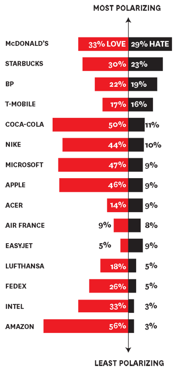
The data has shown that brands with plenty of animosity can still succeed in a big way. Not every company can be loved like Amazon; take a look at the love/hate ratio below, and you’ll see that very polarizing brands like McDonald’s and Starbucks are far and away outperforming their less polarizing counterparts (perhaps the biggest worry is that people feel nothing when thinking about your brand):

In the same way Abercrombie & Fitch’s CEO can get away with saying that the company doesn’t want ugly people wearing their clothes, your company should appeal to an “in” group . . . but without being such a jerk.
Classic examples include places like ThinkGeek, who want “geeks only” for their variety of merchandise, or Apple, who focused more on what their consumers were not (“mindless lemmings”) in order to create division.
Keep It Simple
If there was ever a universal rule for branding, it would be this: the easier it is to understand, the better.
Simplicity allows for better decision making—or at least that is how consumers perceive it. No surprise, then, that according to this research:
75% of consumers are more likely to recommend a brand that they feel is simple.
We’ve talked about the importance of projecting this to new customers via your homepage, as further research has shown the same fondness for simple websites, but this simplicity is really about telling customers what you do and why it’s unique.
In many ways, the appeal of simplicity is seen through all aspects of marketing. In one study of over 7,000 consumers which analyzed product “stickiness”—or the likelihood of consumers to follow through with an actual purchase—the single biggest driver was decision simplicity.
"We looked at the impact on stickiness of more than 40 variables, including price, customers’ perceptions of a brand, and how often consumers interacted with the brand. The single biggest driver of stickiness, by far, was “decision simplicity”—the ease with which consumers can gather trustworthy information about a product and confidently and efficiently weigh their purchase options."
Since simplicity is subjective, how you simplify things for customers depends on what they want. Dollar Shave Club’s entire model—delivering razors to your door—was able to succeed because the unique pitch was easy and focused on the right thing: what a pain it is to go to the drugstore just to buy a razor.
Many “delivery clubs” have followed this model and failed, often because they looked to copy the model without thinking about what they are selling—not everything is made for a delivery subscription model, because the annoyance of purchasing the item just isn’t there like it is for razors.
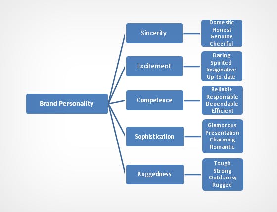
This idea of simplicity also should address your brand’s “desired personality,” according Stanford psychology professor Jennifer Aaker. Her research found 5 common dimensions in a brand’s personality, and people like it when yours is obvious:

Make sure “who you are” is apparent in other areas that reflect customer perceptions as well—JCPenny found this out the hard way when they tried to eliminate sales, a key part of their value-based brand, from their stores. Remember that elements like pricing, packaging, etc., all play a role in how customers perceive your business.
The Intersection of Ideas
The best ideas are often found at a crossroads, and this applies to branding as well.
An excellent example comes from our friends at Zapier. As a platform that lets you connect and automate different apps, branding for Zapier wasn’t “hit you over the head” obvious.
The team found a great crossover by positioning themselves as a way to access “superpowers” to get your work done. To highlight this, the recent redesign makes work of a really interesting comic book style:

You might not immediately think of superhero branding when it comes to a tech startup, but given the widespread recognition of the superhero motif and Zapier’s positioning, it makes absolute sense.
Another benefit of branding “at the crossroads” is the inherent simplicity of connecting two ideas—as long as it’s done right. When people get what ideas you are connecting, your brand is very easy to understand.
A bar with a western theme makes sense and allows us to clearly define what it is. It’s the amorphous branding that you need to worry about: the combining of too many elements or themes that aren’t compatible. If it leaves people scratching their heads, you’ve done something wrong.
When Should You Brand on Perception?
Do you think Land Rover honestly believes that most people who buy their vehicles will be using them for off road trips? Given the amount of SUVs they sell, it’s doubtful.
Despite this, they still brand themselves as the car of off the grid adventures. Why?
Recently, an exceptional article by Marc Barros addressed this issue of why companies should brand on . The stupidly simple reason is because people buy on perceptions, not reality.
Some of the examples Barros chose were hilarious but entirely true:
Perception: Drink this beer and you will be like this guy.

Reality: This girl to guy ratio is about right.
Perception: Your surfing videos will look like this.

Reality: When you aren’t the best surfer in the world and don’t have a professional video crew.
This brings us to the aforementioned Land Rover example. Again, according to Barros:
Perception: This car is for driving to amazing, desolate locations.

Reality: Most owners just take the car to Safeway.
Barros cites a study done on “puffery” in product branding, which found that only the most discerning, experienced consumers were immune to puffery—the act of branding on perception. The watch geek wearing a Vacheron Constantin won’t fall for that James Bond advertisement; they already know what they want in a watch.
Traditional consumers, however, do care about the potential lifestyle that a product may bring—that’s why suburban folks might buy a Land Rover in the first place. As Marc would put it:
It’s not about the performance of the product, it’s about the lifestyle of the person using the product.
It makes sense for a boot company like Viberg to create videos about how they hand craft each boot using the best materials—they are appealing to a very savvy and highly discerning audience.
But for sneaker companies like Nike, who sell to consumers with less of an interest in how the product is made, there’s a real need to brand on perception; if their sneakers are worn by this or that athlete, if you buy them you might play like them, too.
The Supportive Weekly: A newsletter for people who want to deliver exceptional customer service.